NOTE: This post makes extensive use of acronyms. For clarity, “P3R” refers to Persona 3 Reload, “P3P” refers to Persona 3 Portable with “modern” added if I’m talking about the 2023 release, “P3FES” for Persona 3 FES, and “P3” for the original Persona 3 release.
I’ve been playing Persona 3 Reload lately. I’ve been enjoying it. As I got the collector’s edition, I can’t help but notice the logo’s design sticking out like a sore thumb with the size it’s printed at. It is, most assuredly, made with a bitmap typeface whereas RELOAD it is reported to be made with a modified Faktos.
But we’re interested in the “P3 PERSONA3” portion of it.
I needed to find out why it looked…different from how I’d expect something written in bitmap would look like. The answer is not what I expected.
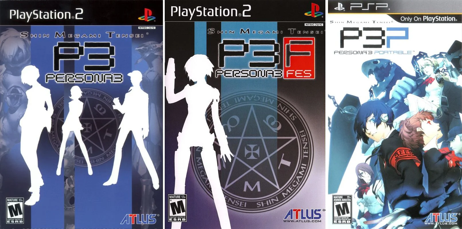
NTSC cover versions of Persona 3, Persona 3 FES and Persona 3 Portable. Note how they all use the design in question with the notable exception of PORTABLE, which uses the typeface used in Sony’s PS2 / PS3 / PSP logo design.
When I first started looking into this, I believed it must’ve been an oversight. At first glance, the logo on the main screen looked okay - for the record, it doesn’t.
Maybe Atlus didn’t had access to the original asset and had to trace the image? Hard to believe, given they released a port of P3P in 2023 and would’ve had to produce assets or, like with the GTA remasters in 2021, used artificial intelligence (AI) tools extensively to make the assets look at least passable on a Nintendo Switch.
Hold the tracing bit, however - we’ll come back to it later.
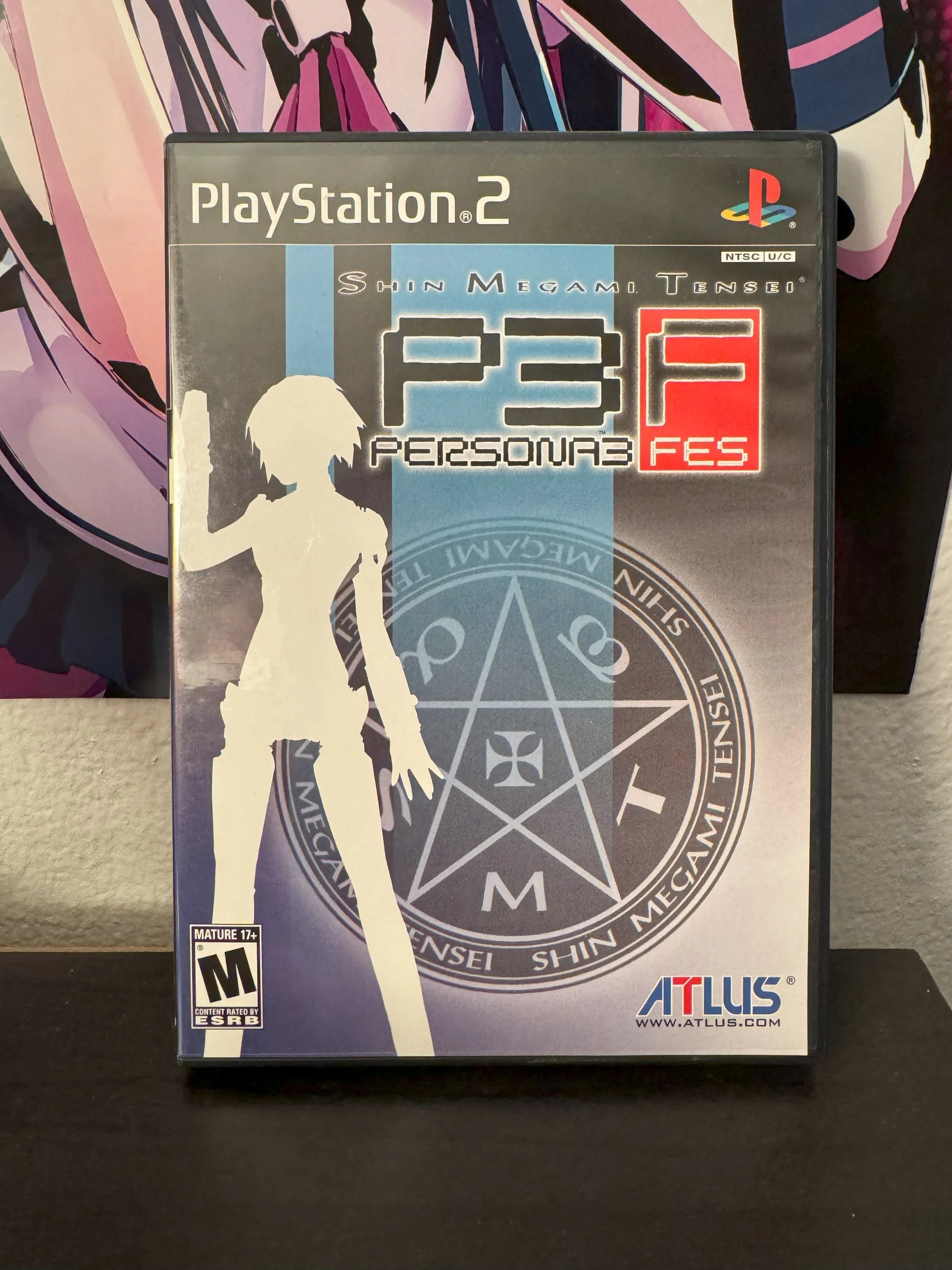
It was at this point I realized I have a copy of P3FES on my shelf, shown above. I pull it out, note the logo and it’s the same as it was on the modern port of P3P and P3R. A search of the P3 box art shows it also includes that rendition of the logo - even going to great extents to ensure I wasn’t looking at a fan rendition of it.
This is no longer an oversight but a deliberate choice. Why? I have to know.
It’s no secret that the typeface used in the P3 logo is BM Space by BitmapMania, a endeavor that made typefaces available primarily to Japanese internet users. Their website is no longer live, but it was sourced through re uploads of their work in different typeface sharing websites. More importantly, it gave a hit on the Wayback Machine.
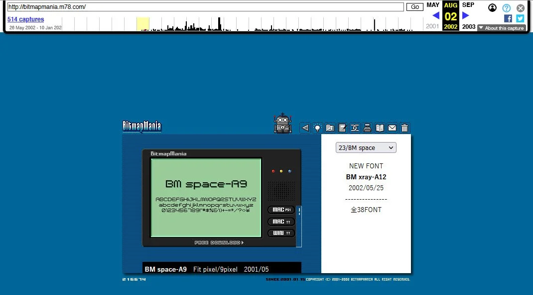
The download page for the BM Space typeface in the now defunct BitmapMania website.
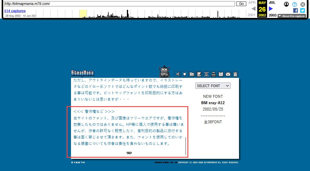
The oldest capture the Wayback Machine had - May 26, 2002 - already had BM Space listed among its download offerings. It was first released in 2001, some months after the website first went live. Before a user would’ve gotten to the typeface list to download the one they want, there’s a read me page, in which the endeavor lists the terms of use for their creations, shown below.
The part inside the red box is what we’re interested in.
“The fonts and images on this site are freeware, but the copyright is not waived. You may use it for personal use on your homepage, etc., but it is strictly prohibited to sell it or attach it to products for commercial purposes without the permission of the author. Additionally, the author is not responsible for any damage caused by using the font.”
Persona 3 is reported to have started development in 2004, putting it within our working timeline. Also reported, Atlus being in bad shape. Given the circumstances, what I think happened - and subsequent explanation of our rendition - an intrepid artist within Atlus may have done on purpose and, somehow, got the okay of the art director and the upper brass.
Using the text tool in Photoshop, I write “P3 PERSONA3” using the BM Space typeface with a font size of 9 points. Going with a small size ensures I get as close to the working result as possible.
I rasterize my text, and place “P3” and “PERSONA3” in separate layers.
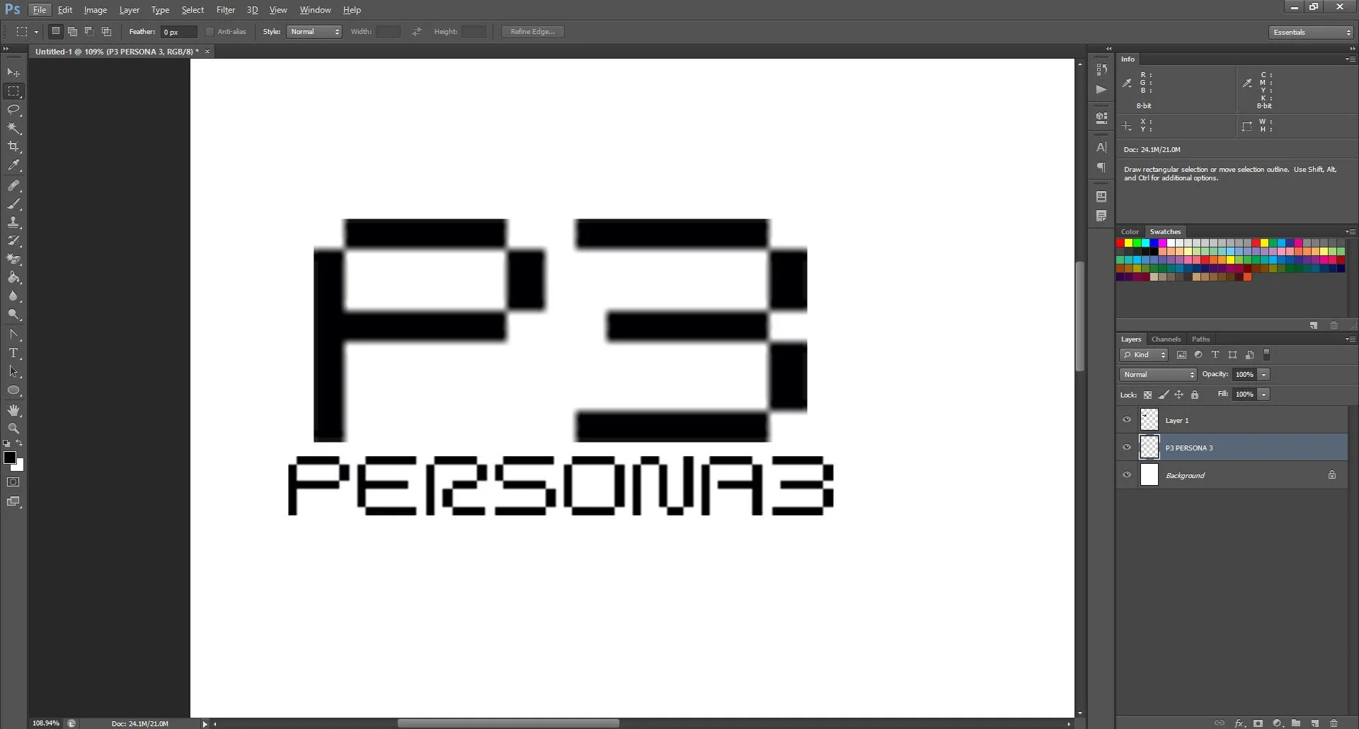
Enlarge “P3” by 1000% using the Free Transform tool.
Place “PERSONA3” underneath our big P3 and enlarge it by approximately 250%, using the Free Transform tool once more.
I save my distorted image. Time to image trace! I mentioned I’d come back to that.
The final result in Photoshop after following the steps above. Note the heavy distortion on the P3 specifically. It was rasterized and enlarged from a size 9 after all…
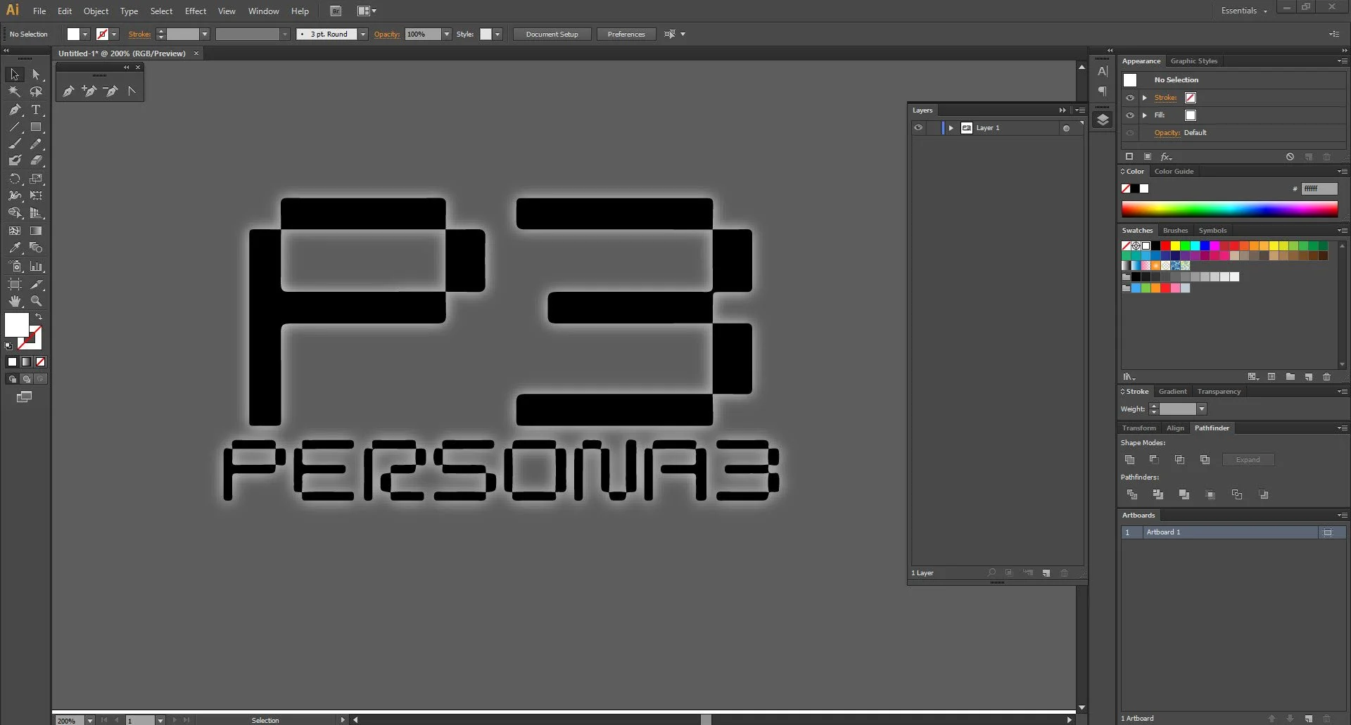
On Illustrator, I open a new document. I look for my image and insert it on my document. Since Illustrator recognizes it as an image, it’ll ask if I want to trace it - why yes, I do!
For my preset, I went with Sketched Art, if only to save me the step of removing the white background.
After my trace is complete, I put the outer glow effect the official logo has in Illustrator instead of dragging it back to Photoshop to do so.
Final result in Illustrator. Didn’t got my wobbly-like lines in the P3, but did got the rounded corners - that is the tell that this logo was traced.
As I understand it, in graphic design and especially in raster graphics, you start big then scale down as needed. I have no evidence pointing to the typeface looking bad in huge sizes and, if scalability was necessary, work in vector to begin with. This is the sort of rookie mistake that screams “graphic design is my passion.”
More troubling to me is that the endeavor may have not been compensated and, effectively, plagiarism happened. While unfortunate that Atlus was in a precarious situation during P3’s development, it isn’t a excuse - the endeavor was willing to have conversations about commercial applications of their creations and Atlus seeks to make money out of theirs.
I suspect not even a conversation was had. Ample opportunity was had to adjust the asset to more accurately reflect a non-trace since P3 came out almost two decades ago and several titles in that series alone, but that’d mean paying royalties to the endeavor. The cynic in me thinks the traced asset gives Atlus plausible deniability that surely delights their legal team.
BitmapMania is no longer here, but Atlus is still around.


